Typographic Compostion Analysis
Jonathan Barnbrook's "Heathen" Cover Work
“Heathen”, an album by David Bowie with the cover designed by Jonathan Barnbrook, was released in 2002. As a contrast to the rest of his work, Barnbrook’s take on Heathen utilizes minimalism to its advantage.
The title is clear and written in “Priori Sans” using uppercase type. “Priori” is another typeface designed by Jonathan Barnbrook in 2003. The title placement is centred reversed upside down. The colour is a warm orange with the opacity slightly turned down to see the content underneath it. The spacing between the letters is somewhat tight and is all aligned. The title is also placed towards the bottom of the cover, but is notably covering Bowie’s upper chest and shoulders. These choices are consistent with Jonathan Barnbrook’s intentions as a designer, as it breaks traditional boundaries and expectations of designs like this.
Regarding how the title connects to the album conceptually, there are many choices that link design, typeface, composition and meaning all together. “Heathen” has a traditional meaning of an individual who is not a part of religious practices/groups/organizations. The placement and reversal of the text could be compared to imagery and meaning of a reversed cross, a concept that is thought to be anti-religious and blasphemous. The neutrality and minimalism of the text itself is a direct contrast to everything that is related to religion. While architecture, artifacts, practices and clothing related to religion are often seen as ornate and sometimes grand, “Priori Sans” has no decoration. Although not typographical, but notable to include, Bowie’s eyes are glowing, a symbol of transcendence while he remains in a black and white background. This signifies that Bowie has transcended the black and white views of the world and religion, instead he is breaking free of these normalities, similar to Barnbrook’s intentions as a designer. All of these design choices are clear and intentional, they are not purely for enjoyment visually, but push an ideological standpoint and is bathed in intense metaphors.

"Heathen" Album Cover by Jonathan Barnbrook (2002), Album by David Bowie.
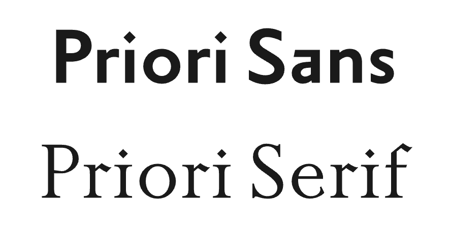
"Priori" Font by Jonathan Barnbrook (2002).