Jonathan Barnbrook's Contributions
What is his most significant contribution?
Jonathan Barnbrook’s most significant contribution to the field was figuring out a way to use typography as a tool, especially for political and cultural expression. Barnbrook was able to not only expand but breach certain boundaries set by the industry. He was able to use typography as a medium in itself for critique, emotion, and authoring many different ideas and thoughts. Typography was seen as a pencil and paper to Barnbrook, as it was forever evolving and had the opportunity to be developed into anything. Jonathan Barnbrook was able to shift the perspectives on typography, while others were focusing on exclusively legibility and precision, Barnbrook was focusing on the ideologies behind his designs and how to execute them through what other typographers were basing their sole focus on.
Barnbrooks fonts are an excellent example of this, as “Bastard”, “Exocet”, and “Mason” are all fonts that provoke a feeling from an individual who encounters them. These designs don’t just support a message being written in text, but the design is the message. They provide a commentary on the world while remaining a visual way to do so.
These contributions changed the way that typefaces and typographic compositions were typically composed and designed, as Barnbrook was able to promote themes and messages through his work, as well as have groundbreaking visual designs. He was able to prove to designers that the art of typography was so much more than just a simple communication tool that was stuck to specific standards, but they could create their own in order to convey a message.

"Bastard" Font by Jonathan Barnbrook (1988).
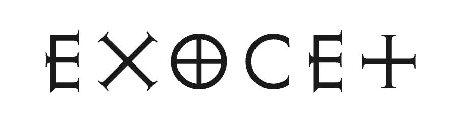
"Exocet" Font by Jonathan Barnbrook (1991).
What has he influenced in the field?
Through these contributions, typographers have become more than just communicators, as more and more activists have found their way to use graphic design, and specifically typography as their key tool. Using typography as a form of protest, as not only the words but the designs also hold political weight, has become more and more common practice. This practice has spread outside of graphic designers and typographers, as many individuals are able to use this technique when sharing their voice and thoughts. Barnbrook has helped develop and popularize a form of art and protest that is accessible to people outside of the industry, something that should not be overlooked. This is an important contribution on many levels, as it not only provides designers with a voice, but the public as well. The opportunity to bridge this gap makes not only art more accessible, but invites an even more democratic process as citizens participate in movements and protest. Barnbrook is a critical figure in design for this exact reason.
Forms of his type such as “Bastard”, “Exocet”, and “Mason” exhibit these properties and challenge how typefaces are normally designed. An example of a highly recognized typographic design that has a politically charged message associated with it is the “Coexist” work by Polish artist Piotr Młodożeniec. Although not directly cited as inspiration from either graphic designer, the piece is yet another representation of the work that Barnbrook was helping to push to the industry at the time, as both Barnbrook and Młodożeniec were active in the late 90s and early 00s in shifting how typography was used.

"Olympukes" by Jonathan Barnbrook (1997, and updated in 2012).